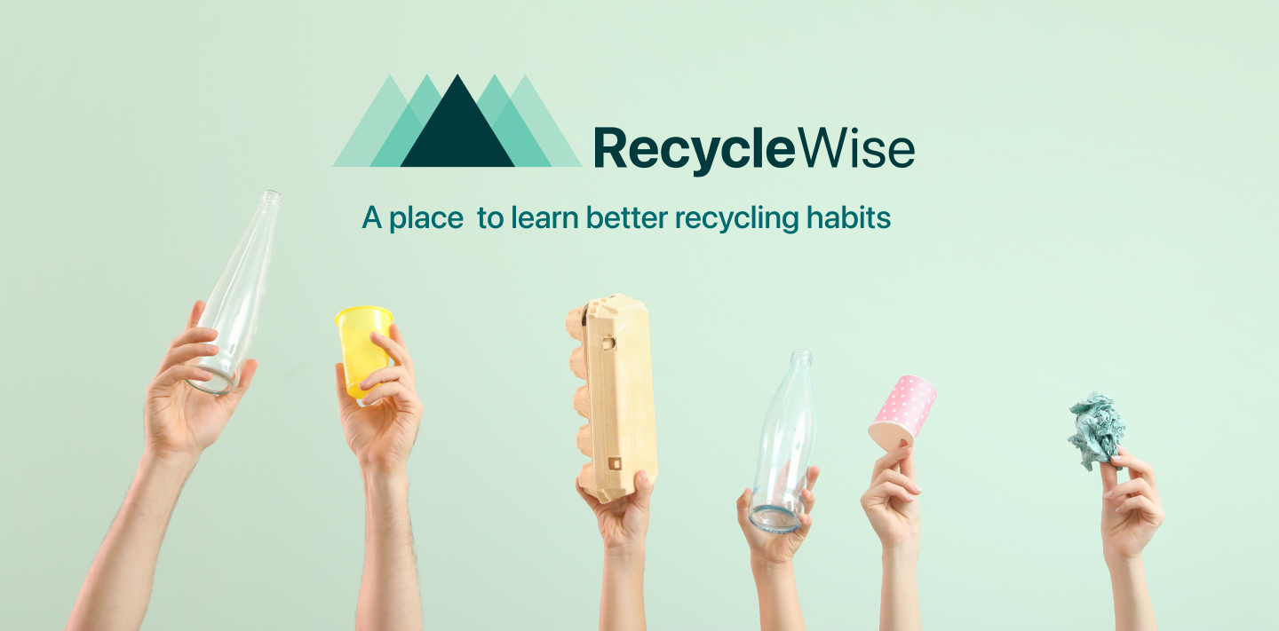
Project Background
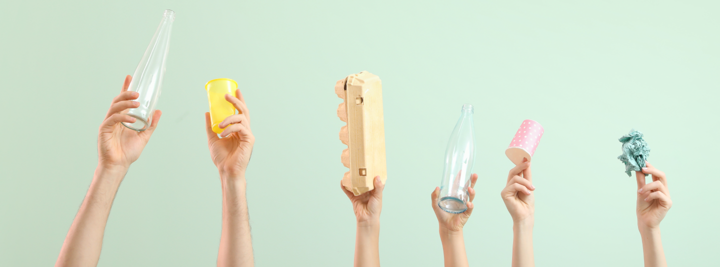
Climate Change is an issue that is becoming more and more impactful to our lives. There is a lot of talk in the media about systems in our society that need to change in order to combat Global Warming. In the midst of all of this talk it can be hard for each of us as individuals to remember that our actions can impact the world around us. Education is key to help remind people of this. The primary mission of RecycleWise is to educate people in good recycling practises in the hope that through all of us working as individuals we can come together to help stop Climate Change.
“Education is the most powerful weapon which you can use to change the world”
— Nelson Mandela
Project Solution
Through user research both secondary and primary I discovered that the reasons behind people's apathy towards recycling comes down to a lack of education and motivation. I also discovered, particularly through my user interviews, that people often stick to a lifestyle change/ new habit if they are surrounded by a community of like minded people all making a change together.
Educate, Motivate and Community are the cornerstones from which I built the project RecycleWise.
Potential Users
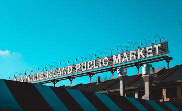
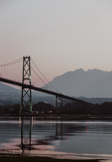
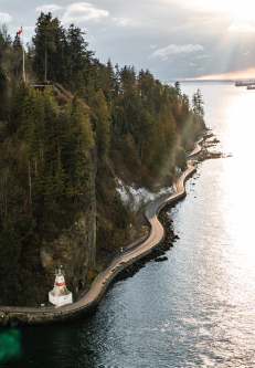
The website and application is targeted at people living in the City of Vancouver (Canada) as that is where I am living. I felt that it was important for me to understand the everyday user, therefore basing the project on the city that I live in made sense as I could observe people interacting with the systems first hand. I could also use my own experience and understanding of the systems as a benchmark while conducting research.
My Role
User Experience Designer
User Interface Designer
Prototyping
Usability Testing
Tools Used
Figma
Miro
Marvel
Timeline
September 2021-January 2022
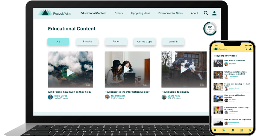
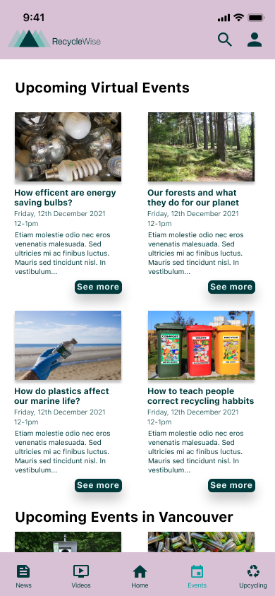
Educational Content
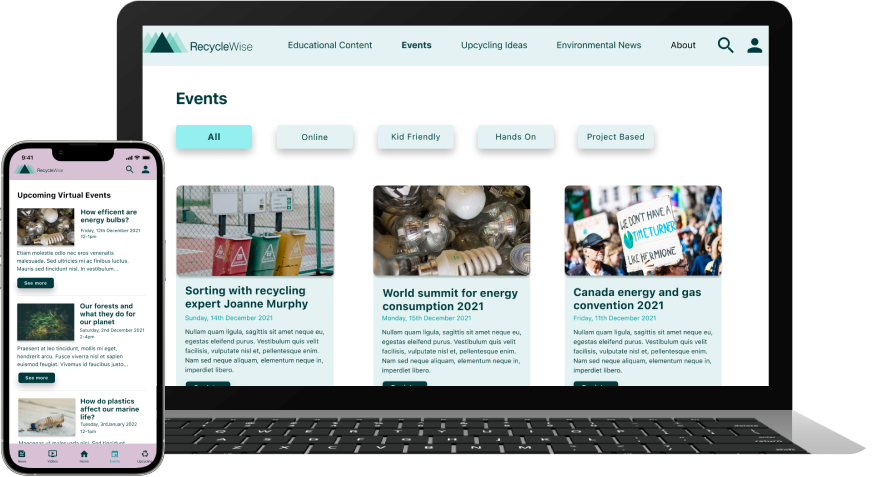
Events

Environmental News
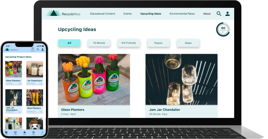
Upcycling Ideas
The Design Process
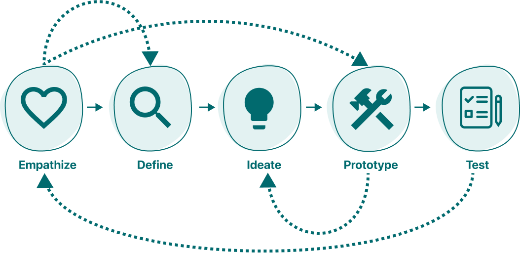
In order to really get an understanding of my users to find out their frustrations to help ideate solutions I followed the iterate process of Design Thinking.
Conducting Research
-2016 Survey Conducted by Recycle BC
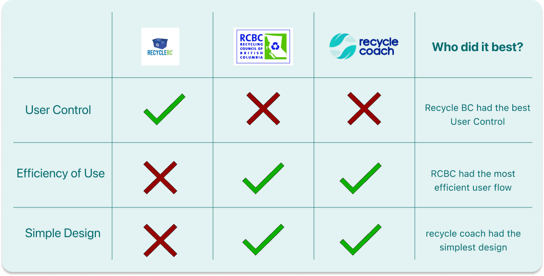
The Competition
I conducted a heuristic analysis on three websites that were designed to help people learn more about recycling. During my research I was really surprised that the three sites that I found were the only three that I could find. Two of the sites were from the local Government and mostly contained information about locations of local recycling centres and one was from the United States and it was specific to certain Municipalities. Overall there was a definite lack of online resources for people hoping to find information quickly.
The heuristic principles that I used while conducting my analysis were;
#3 User Control and Freedom
#7 Flexibility and efficiency of use
#8 Aesthetic and Minimalist design
Identifying the Users
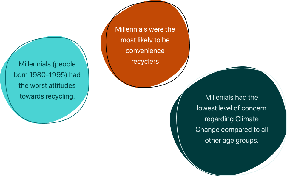
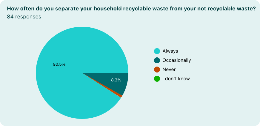
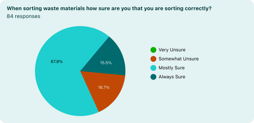
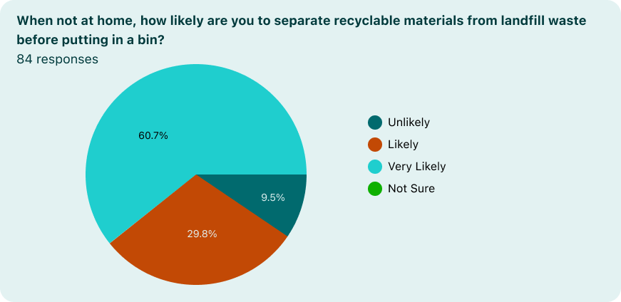
After I had conducted sufficient research I felt I had an age group that I wanted to target with my product. I was curious to see if the attitudes reported by the 2016 survey by Recycle BC would be reflected in my screener survey.
Overall I had 84 responses.
Understanding the Users
I conducted 5 in person interviews.
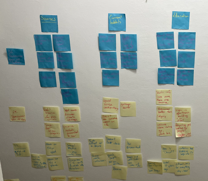
To help document and organise the user insights gathered from the interviews I created an affinity map. The affinity map helped me to organise observations, quotes and user thoughts.
Empathising with the User
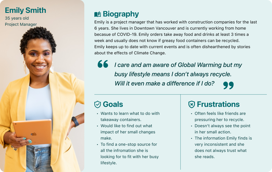
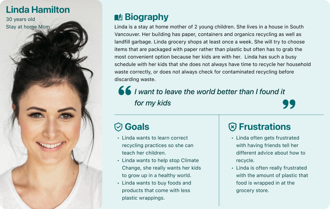
To help put myself in the mind frame of my users I used my User Research and Insights to create three personas.

With a good understanding of my users and their needs I could define my user frustrations more clearly. By using How Might We Statements I discovered I could turn those frustrations into design opportunities.
How might we educate the inhabitants of Vancouver about correct recycling practices?
How might we motivate people in Vancouver to engage with the recycling process?
How could we boost the conversation about recycling and climate change within the city of Vancouver?
How might we increase awareness surrounding recycling contamination?
User Stories
In order to keep the needs of the user at the centre of my design process I created user stories to identify various tasks my users would want to accomplish while using the product.

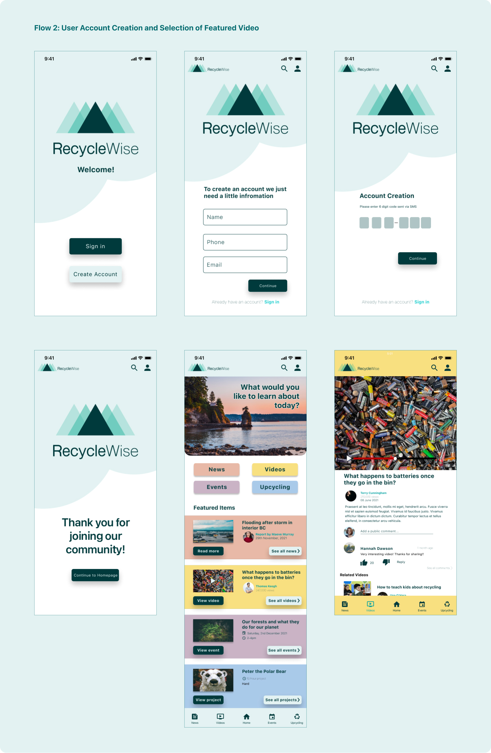
Using all of my research and insights I started to come up with solutions to my user problems. These solutions became the foundation of my Minimal Viable Product (MVP).
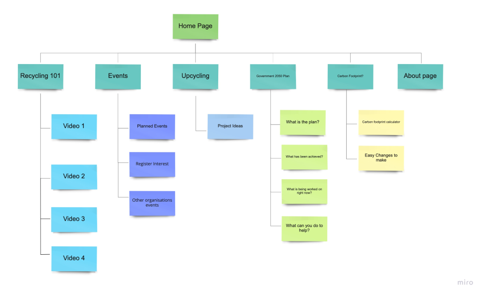
Sitemap
To help me to lay out the structural hierarchy of my product I developed a sitemap to show how the flow of the website and application would work.
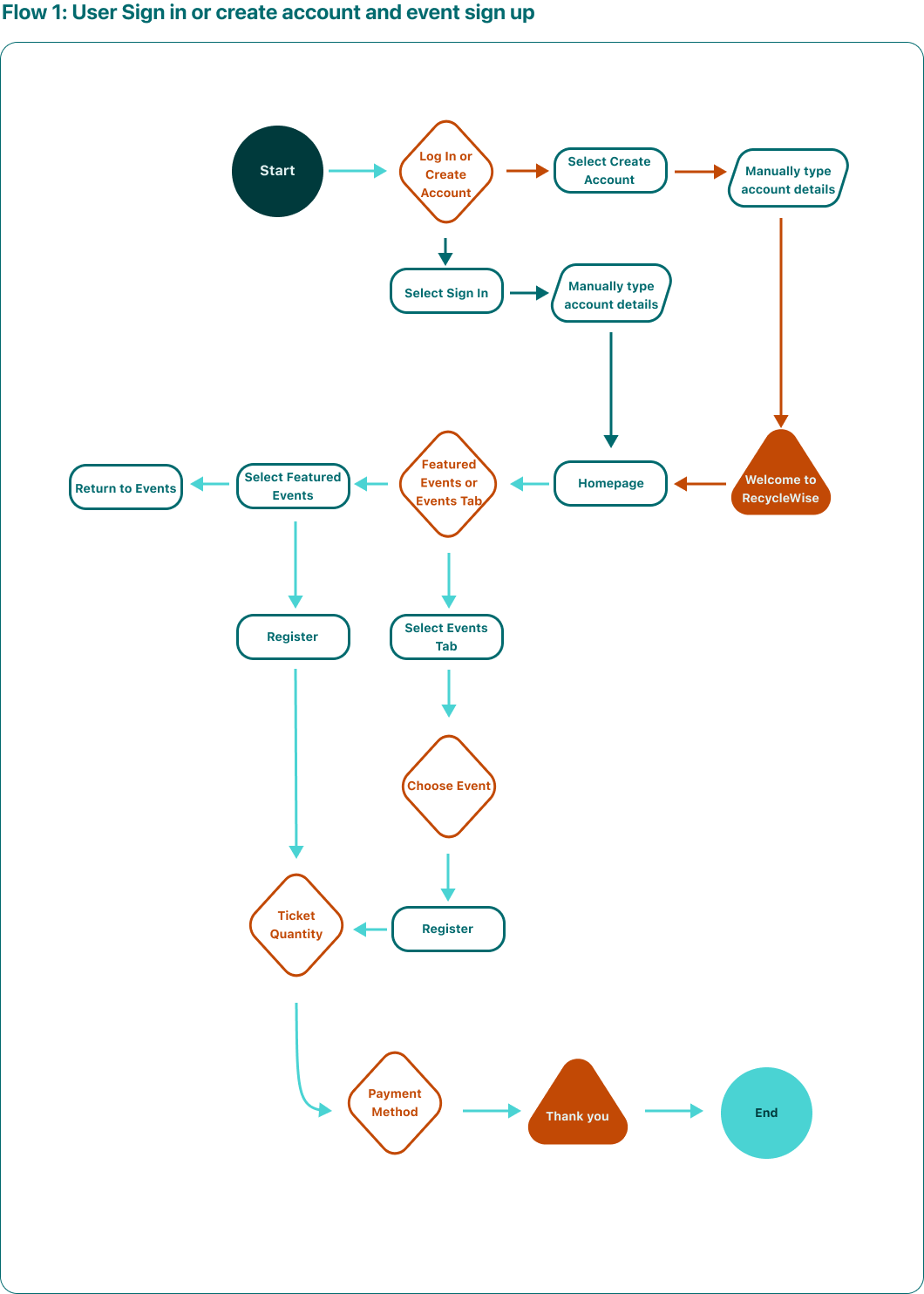
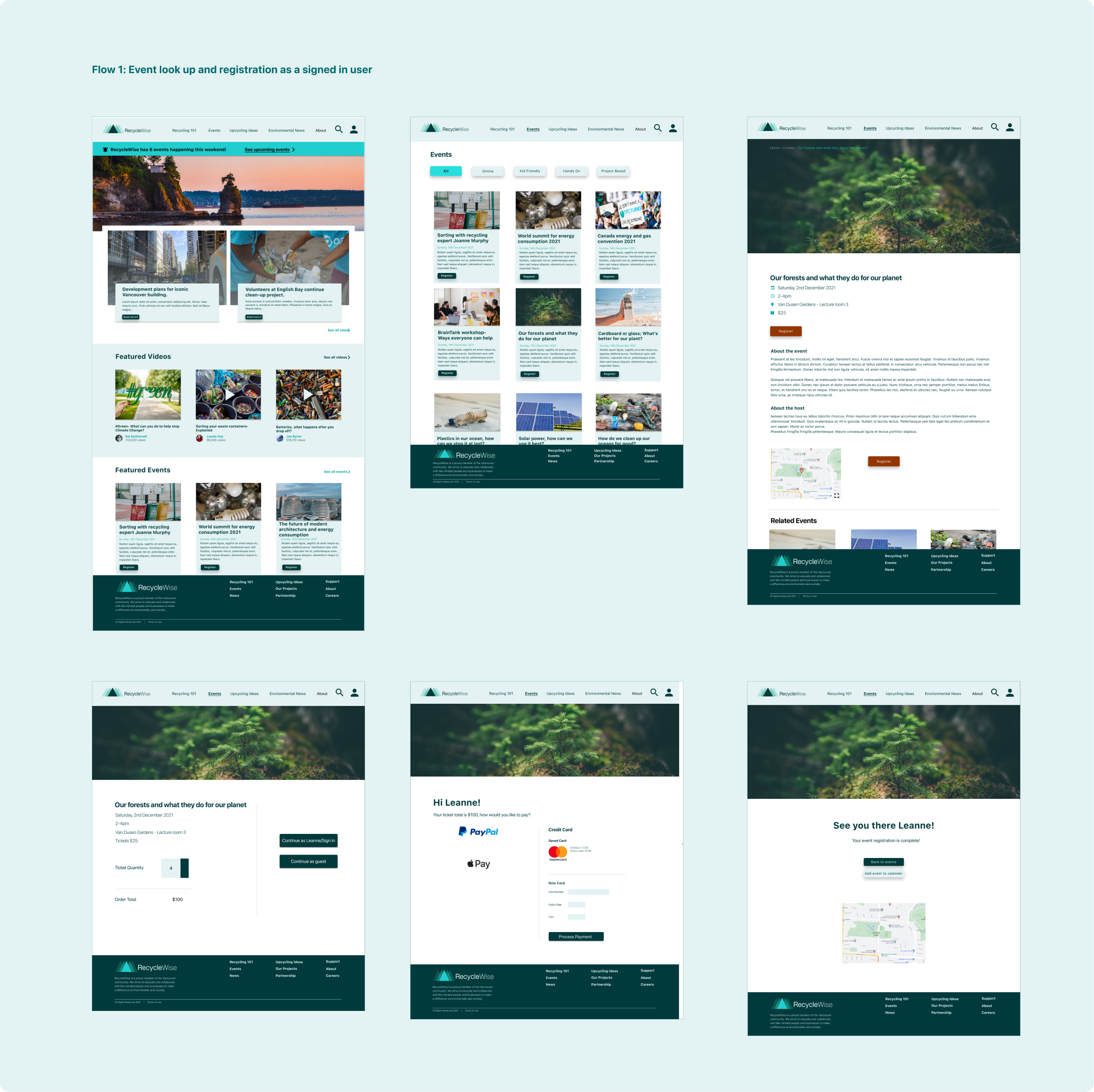
User Flows
I created user flows for the most common routes users would take while using my product. I used the user flows to identify necessary and superfluous screens in the interaction process.


Sketching
Using my user flows as a base, I created sketches and tested the flow with three participants through guerrilla testing.
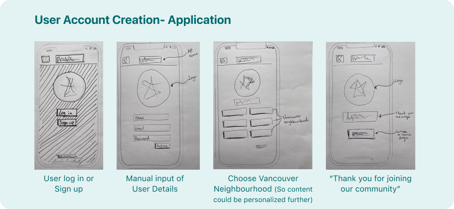

My two main takeaways from my guerrilla testing were that for the application the bottom navigation bar was not clear enough, the users had difficulty using it.
The purpose of the product was also not immediately clear to users. I deliberately did not tell them the type of product they were testing prior to the test to see if its use was clear. It was not, which meant I needed to improve my layout as I brought my sketches to the next stage; Wireframes.
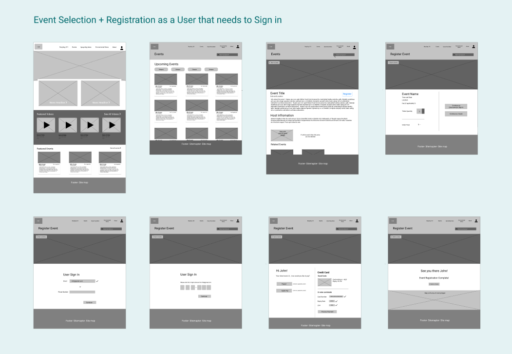
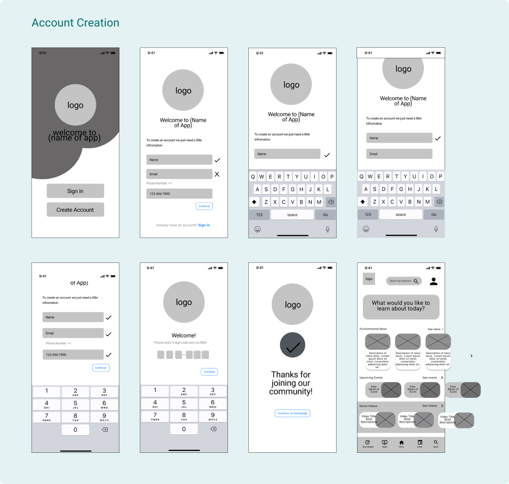
Low Fidelity Wireframes
Taking the feedback from my guerrilla usability testing on board I created a series of low fidelity wireframes to establish the design of key screens. Creating my wireframes using a grayscale palette I was able to focus more on the usability and layout and less on the content.
Mood Board
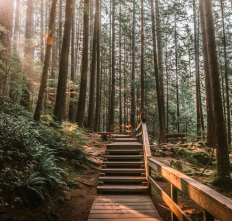
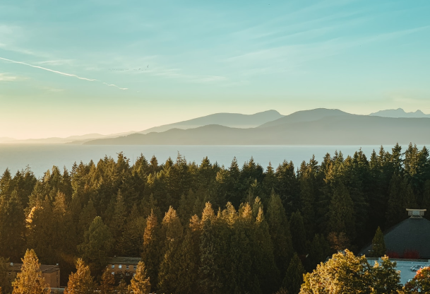
I created my mood board with Vancouver and the province of British Columbia at the forefront of my mind. I really wanted the site to read as a melding of urban life and majestic landscapes, just like the city itself.


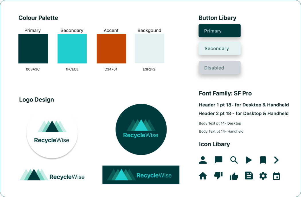
Brand Platform and Design System
I established the Brand Platform with particular consideration for my target audience. Building trust within my brand was an essential part of my MVP.
Brand Mission
The mission of RecycleWise is to educate, motivate and create a sense of community surrounding recycling in the city of Vancouver.
Using education and community the hope is to motivate the people living in Vancouver to engage more with the recycling process in the hopes that it will help battle climate change.
Brand Personality
RecycleWise has a topical, genuine purpose. It is a place for people to learn better habits and become more educated about the impact they can have on their environment.
Brand Attributes
Clean, easy, trust, fun, authentic

My colour palette was inspired by the rich forests within Stanley Park, an iconic part of Vancouver and I selected San Francisco Pro as my type because of its readability and adaptability in size and line thickness.
High Fidelity Designs and Prototyping
Once I had established the components of my product, it was time to start the high fidelity wireframes.
Usability Testing
I conducted two rounds of usability testing with five participants in each.
Challenge 1
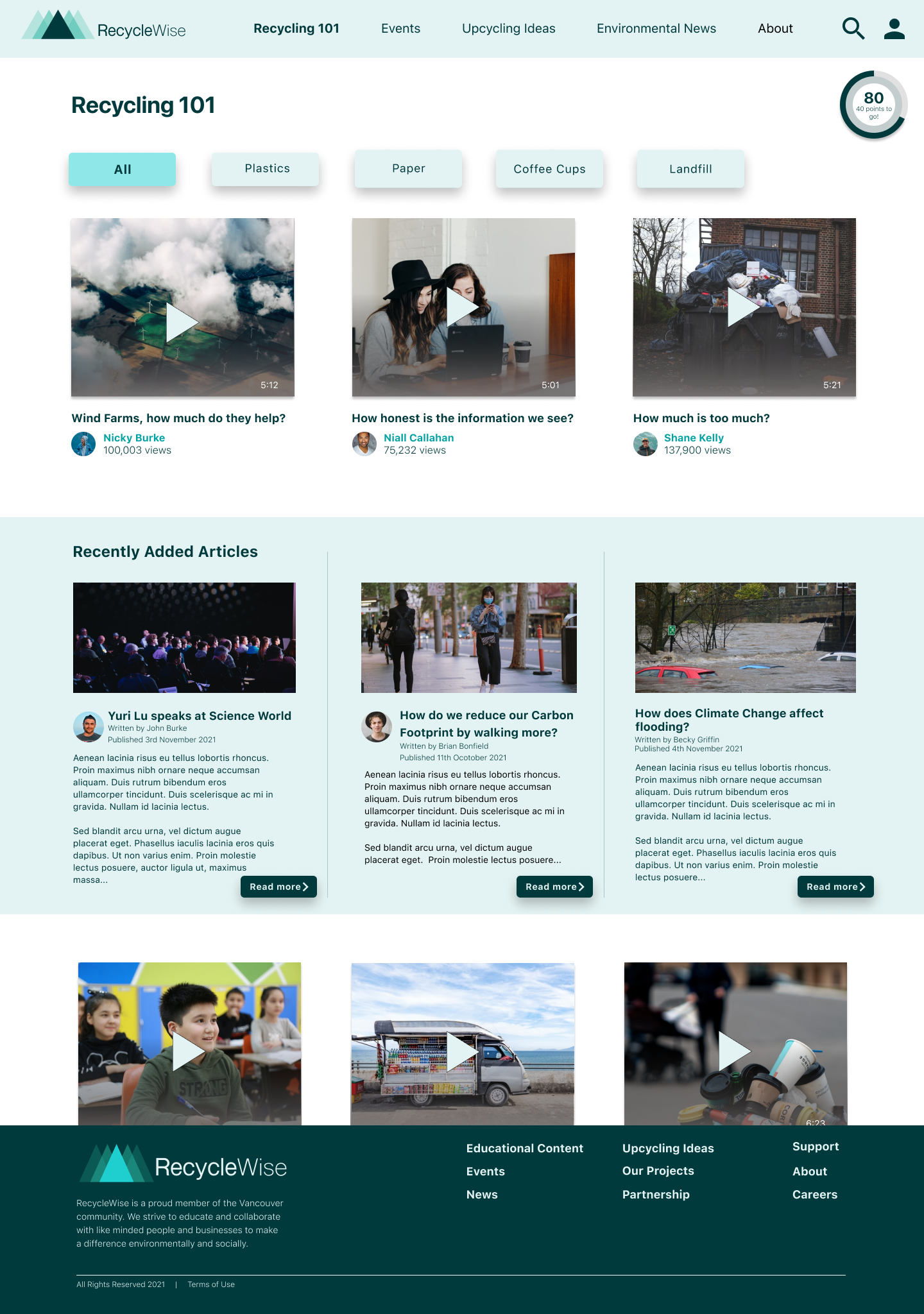
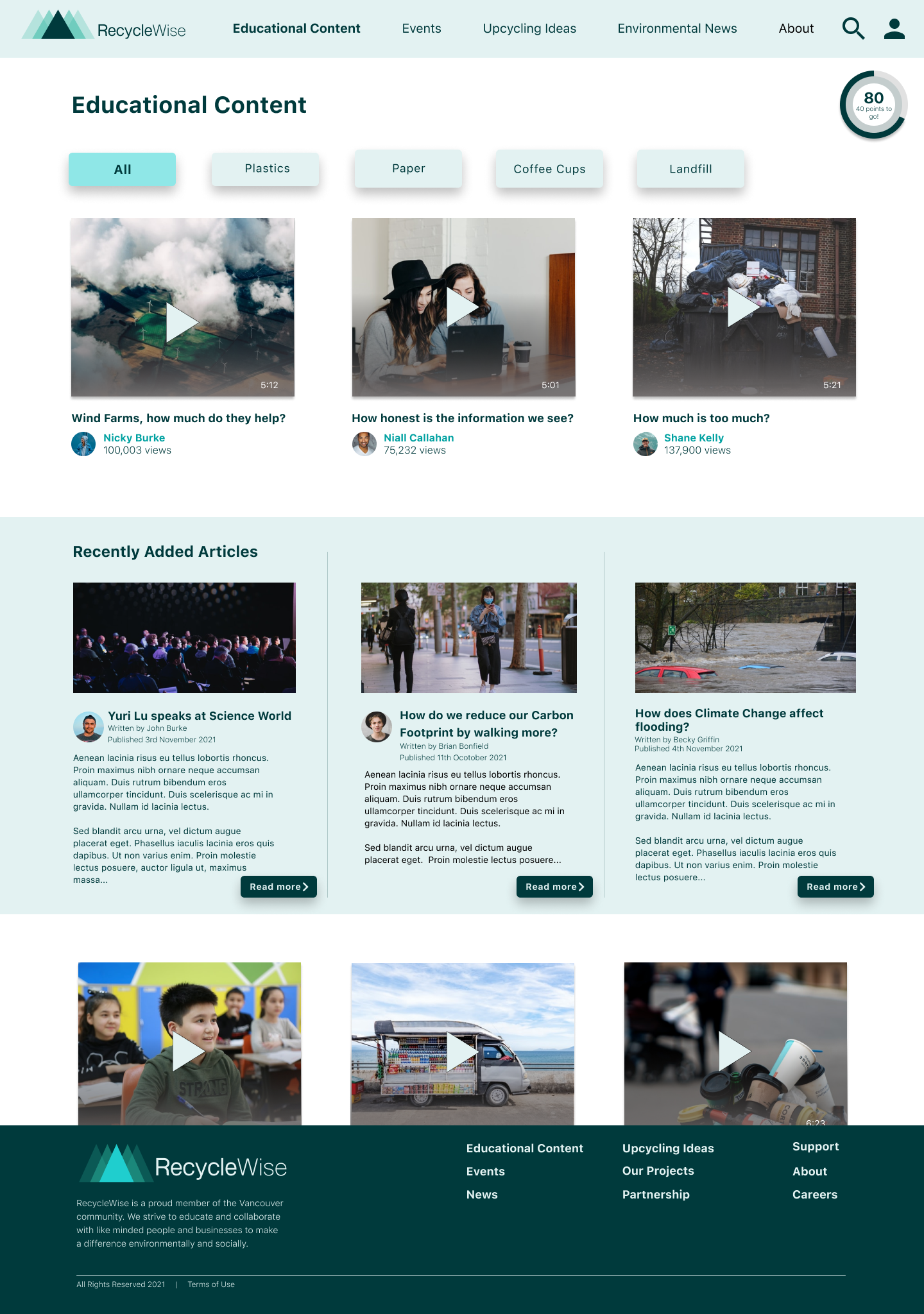
“Recycling 101” was not read as a source for educational content. Users completely missed this tab on the website version of the product.
Solution 1
I changed the tab name to “Educational Content”. In Round 2 of testing the users immediately understood what the tab contained. They had no problem finding the educational material they were asked to find.

Challenge 2
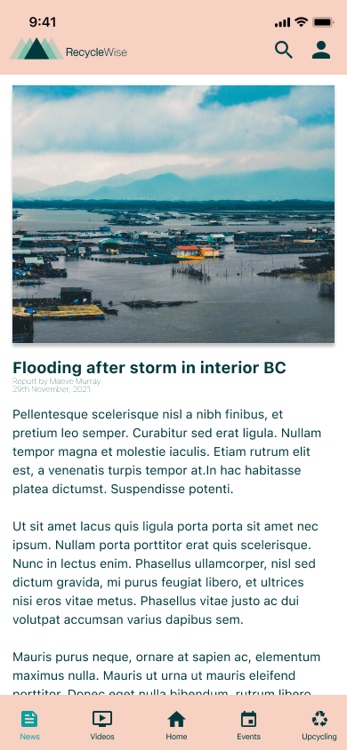
The font size of the application copy was too small, 4 of the 5 users had difficulty reading the text.
Solution 2
I increased the font size from 10 to 14. This solved the problem and no users had difficulty reading in Round 2 of testing.
Challenge 3
Some users had difficulty reading the titles of events and videos because the font size was too small.
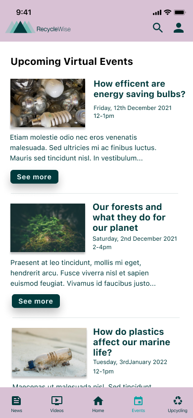
Solution 3
I increased the font size and the space around elements.
I also made the buttons larger as they were too small, particularly for a handheld device.
Round 2 of testing did not bring up any usability issues.
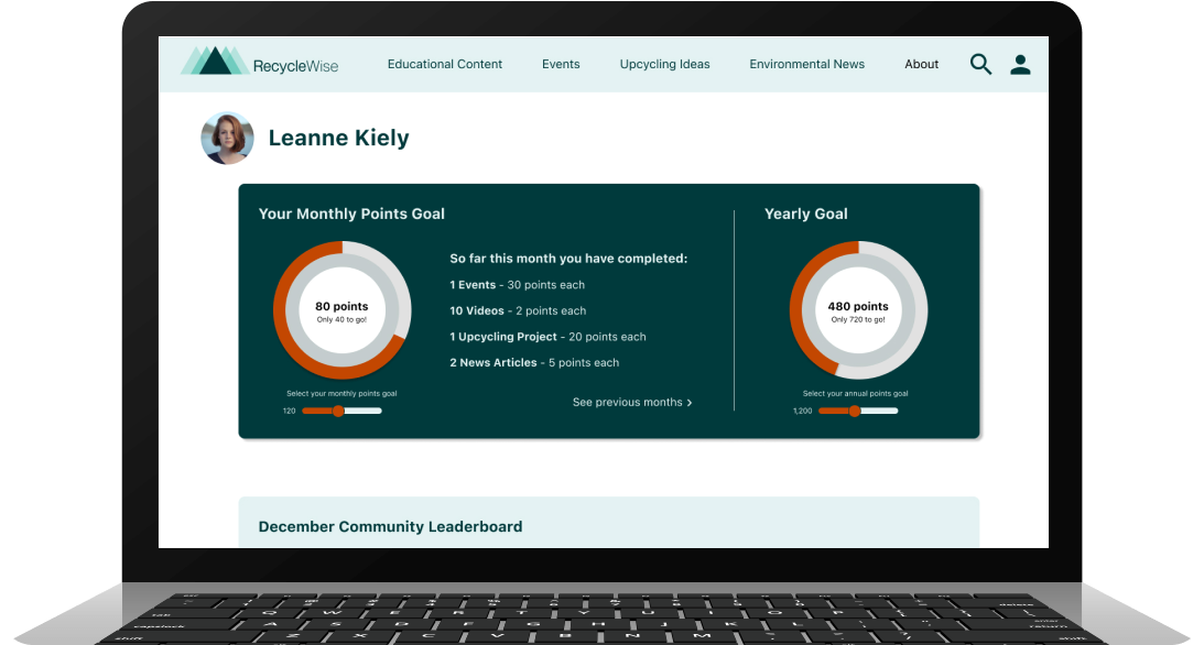
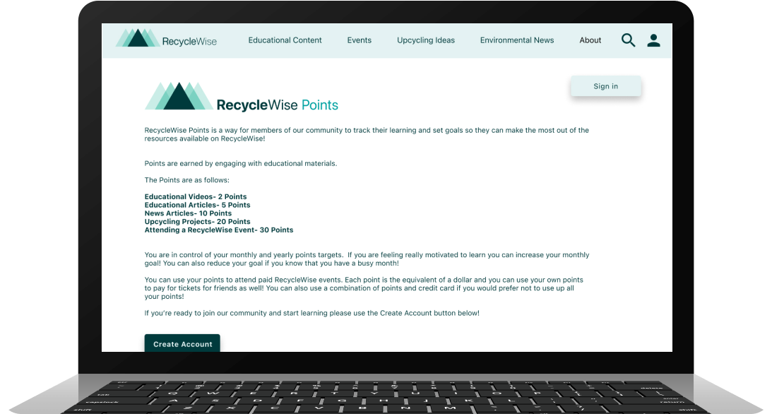
Gamification
Throughout the project I felt that I had created a hub for learning but I had not quite fulfilled the other two themes that my user research indicated that I would need in order for the product to be really impactful and useful to people. During a conversation with my mentor Manprit Kalsi we were discussing reading material that would help make me a more well rounded designer. Manprit recommended several books, one of which was “Gamification” by Brian Burke. While I was reading it I was struck with the realisation that a gamified element to my product would allow me to bring in the motivation and community aspects to RecycleWise.
The premise is that users collect points by engaging with content. They set monthly points goals to help motivate them to engage and learn more about recycling. The points can be redeemed similar to credit card points in order to attend paid events.
Users also can compete with other RecycleWise members in the Points Leaderboard allowing for some friendly competition between members, all with the goal of more learning and increased awareness of environmental news.
What’s next for RecycleWise?
The site and application would next go to developers. There would need to be Tracking Tools added to the coding of the website/application in order to prevent users from collecting points unless they have actually engaged with the content. Mouse tracking or heat mapping might be good options.
Reflections
I have learnt so much during this project. I have been challenged and have gone out of my comfort zone but have enjoyed the UX process immensely. My three main takeaways would be;
Slow down, insights come when you work the process. Do not try to rush and risk missing something important.
Approach research with a blank slate, you never know what ideas or biases you might have that could cloud your direction. Let the research lead you.
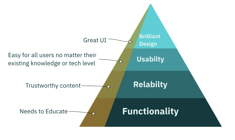
Aesthetics are important but they are not the most important. Coming from a design background this was perhaps the hardest for me to grasp but it doesn’t matter how pretty your product is if there are usability flaws.