Project Background
Amplify is a media company that launched a product two years ago. It was a freemium model that has a mobile-web experience and a mobile app for both iOS and Android.
Amplify’s business strategy was to first build a user base by offering a free product and then evolve the feature set so they could monetize on a premium (paid) product. At this point, the product has been well received and has a healthy user base of free users. They now need me to design an experience that will allow users to subscribe and pay a monthly fee.
Project Goals
Create the opportunity for new users to subscribe to the premium product upon registration in the sign up flow.
Create the opportunity for returning free users to become paid subscribers in the sign-in flow as well as within the product (once logged in).
Project Solution
Amplify now offers 2 versions of its services, Freemium and Premium. Premium users have unlimited downloads, skips and ad free music! They can choose any song to plan anytime from Amplify’s massive music and podcast library.
Freemium gives users access to the music and podcast library but they will not get the awesome features offered by Premium.
Freemium users will, however, get to experience the Premium service! For every 100 hours they listen to content on Amplify they will get 20 hours of Premium access. That means for those 20 hours they can download to their heart's content, skip as many songs as they want all while listening to ad free music! Freemium users can also upgrade at any time in the app choosing the plan that works best for them.
Happy Listening!
My Role
User Experience Designer
User Interface Designer
Prototyping
Usability Testing
Tools Used
Figma
Timeline
24th February- March 23rd 2022
The Design Process
In order to really get an understanding of my users to find out their frustrations to help ideate solutions I followed the iterate process of Design Thinking.

Industry Leaders
To begin my research I looked at 3 products that are at the top of the media industry:
- Spotify
- Apple Music
- Youtube
I was interested in their sign up flows and how users were encouraged to upgrade in the app.
I began by trying to sign up for all three. I made notes on what I thought worked and what could be improved while also keeping my eyes open for Call to Actions and seeing how these products utilised prompts.
Heuristic Analysis
I conducted a Heuristic Analysis of these products using 3 principles;
#1- Visibility of System Status
#4- Consistency and Standards
#8- Aesthetic and Minimalist Design

User Survey
I wanted to get some data to reach a well rounded understanding of my everyday user so I conducted a User Survey.
I opened it to all age groups but I did focus more on the feedback from my target age group 18-24, as outlined in my project brief.


Analysing the results from my survey I was able to see that most people upgraded to avoid limitations and advertisements in the free version.
Most people (40% of responses) took a full year to upgrade. This showed me that people really liked to take their time to get to know the product before committing to a paid subscription.

My main takeaways from the affinity mapping were;
People mostly upgraded for better features offered by premium products.
Four out of five users found the frequent advertisements in the freemium version very annoying and that was a motivator to upgrade.
Users typically carry out other tasks while listening to the app, so a clear and easy to navigate UI is essential to the success of the product.
Empathising with the User
Working from my User Survey and User Interviews, I classified 4 user types that would likely reflect Amplify’s target audience.
Freemium- No Thanks!
This group will sign up for premium easily. They have the budget and the interest in music to make this a very easy choice.
Freemium for a While
This is the group of people that have used the freemium product for a while but have just decided to upgrade. I wanted to explore the reasons why now was the time for them to upgrade.
Freemium for Now
This group are people that are using the freemium product for the moment. They are interested in upgrading but right now it is not a priority for them or they are not actively motivated to upgrade. I wanted to see how Amplify could become more important to them, how can upgrading become a priority?
Freemium Forever!
This group is happy with the freemium product. Either their usage is too low to warrant premium or they really do not mind the limitations of the products.
Personas
I created 4 personas to help make my user groups more tangible.


Empathy Mapping
I was most interested in understanding the motivations and goals for the groups;
Freemium for a While
Freemium for Now
I created an empathy map for these groups to help uncover user insights.

Freemium for Now

Freemium for a While
How Might We?
With a good understanding of my users and their needs I could define my user frustrations more clearly. By using How Might We Statements I discovered I could turn those frustrations into design opportunities.
How might we encourage users on the fence to upgrade?
How might we design an experience that effectively prompts the user to upgrade regularly?
How might we help users make upgrading to premium a priority in their budget?
How might we create an experience that builds loyalty and trust with our users to sustain the product long term?
Ideation
Laddering
As this was a solo project, I had to find methods of ideating alone.
One method I found very useful was Laddering.
This technique allowed me to look at grounded examples of my users needs and wants and then move up the ladder to think more about why a user might want to complete a task

User Stories
In order to keep the needs of the user at the centre of my design process I created user stories to identify various tasks my users would want to accomplish while using the product.


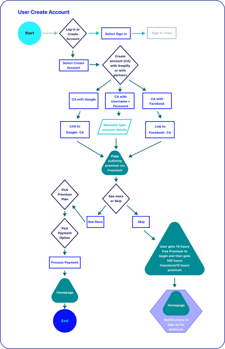
User Flows
I created user flows for the most common routes users would take while using my product. I used the user flows to identify necessary and superfluous screens in the interaction process.


Sketching
I drew sketches of key screens using my user flows as a starting point.

Wireframes
Using my sketches as a basis, I designed low fidelity wireframes to establish the design of key screens. I then conducted 5 usability tests of my wireframes before moving to high fidelity.


Style Guide
At the beginning of the project, I created a style guide and colour palette for Amplify. Before I began creating my high fidelity designs, I reviewed my style guide to make sure that it worked with the user feedback and insights I had gained since the start of the project.

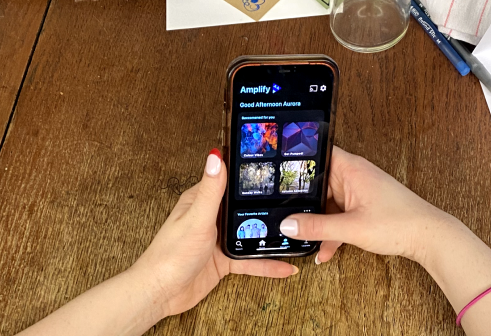
High Fidelity Designs
Once I had looked at my wireframes and incorporated the feedback, I created my High Fidelity designs.
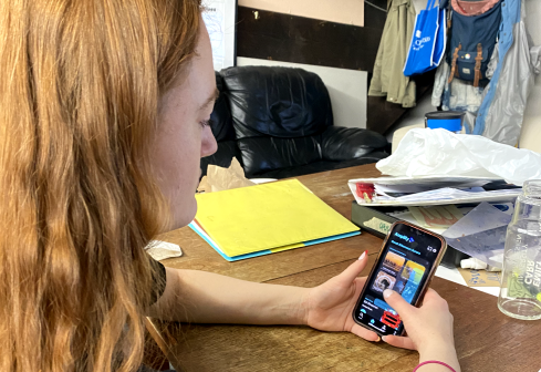
User Testing of High Fidelity Designs
I then conducted 5 user tests with my high fidelity designs

Challenge 1
My users wanted to go back to previous screens to re-read information but couldn’t, also one person wanted to have the option to skip the introduction.

Solution 1
I added a skip, next and back option for users so they have full control of the introduction flow.

Challenge 2
When on the pay type selection screen, some users felt a little disoriented because there was no information carried from the previous page to confirm what plan they had selected.

Solution 2
I added more information letting the user know the plan they choose and how much they would be charged each month.

Challenge 3
The features and plans page was a little confusing for users, the upgrade button in the middle of the screen really threw off the users flow of the page and they seemed to lose trust in upgrading.

Solution 3
I changed the layout of the page to show the plans, with the option to upgrade first and then the features and benefits of both plans. My thinking being that the returning user that is upgrading will already be aware of the features from the aural advertisements, so they will be first looking to select a plan and upgrade.
Iterate
After my usability testing and iterations I felt that my designs had completed the project brief to;
Create the opportunity for new users to subscribe to the premium product upon registration in the sign up flow.
Create the opportunity for returning free users to become paid subscribers in the sign-in flow as well as within the product (once logged in).
Next Steps for Amplify
From all of my research, the UI of my competitors was an important part of encouraging users to upgrade but the recurring thread through all of my user research was that the aural advertisements were far more persuasive than the visuals.
Therefore, I would suggest that the next UX project for this product would be to explore the best ways to present these aural prompts to the user. What language works best for our target age group (18-24), how frequent should these prompts be to maximize user conversion to premium while also minimising user drop off.
This is a product that requires a true holistic approach as it engages so many of the user's senses.
My Takeaways from this Project
This project taught me quite a few things while really helping to improve my UI skills.
Competitive analysis is so, so important. There really is no point trying to reinvent the wheel. Look at what others are doing. Learn and try to improve upon it.
Creating Amplify helped me see the benefit of really addressing the needs and wants of each of your user groups. You need to understand what motivates different user types and build an experience around those motivations.
Ideating by yourself is possible but it does feel a little limiting. Bouncing ideas off friends and family can really help to develop your ideas and allow you to see perspectives you hadn’t thought of. You are never really alone with your idea!